QATIUM · MAY 2026 — AUG · Shipped
Improving perceived performance
Designing the wait so that heavy hydraulic work felt responsive.
The simulator felt slow long before the engine was slow. A process-driven architecture exposed its internal milestones as a stuttering experience, so I designed a status-driven feedback loop that made the same timings feel intentional.
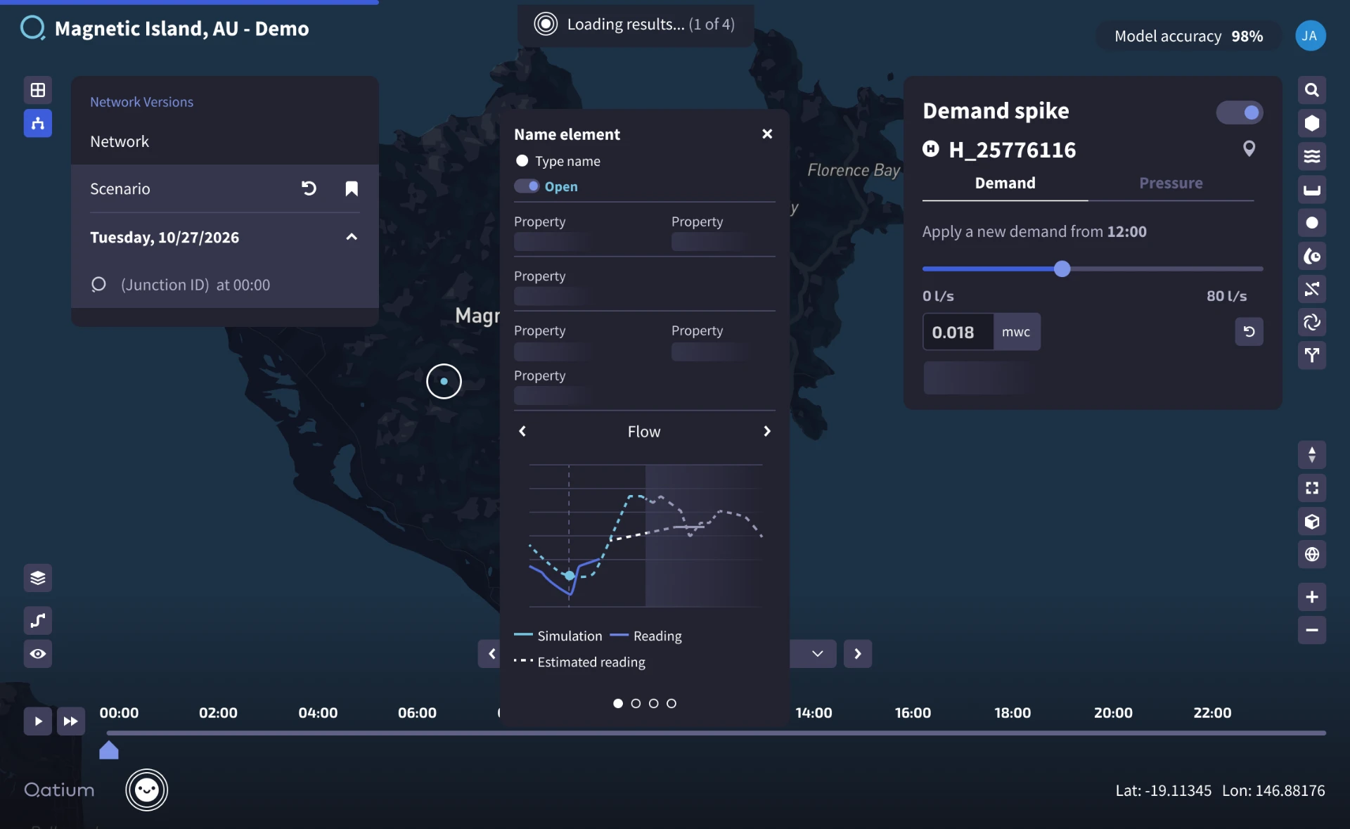
The new approach: a single status pill announces the work, while skeleton loaders hold the graph and property panel's shape — one coordinated progression replaces four disconnected cues.
- Role
- Senior Product Designer / Product Owner
- Team
- Product Operations, engineers, domain experts
- Scope
- Discovery to delivery
- Surface
- Web app, data-heavy views
Overview
Qatium simulates water networks. Loading a network and running an operational scenario take real time: hydraulic computation is expensive and the data is large. Some of that time is unavoidable.
The complaint wasn't the number of seconds, it was the uncertainty inside them. I treated the wait itself as a designable surface, and led the work end to end as designer and product owner.
Challenge
Users described the product as slow, and in a decision-making tool slowness reads as unreliability. They couldn't tell whether the product was working, stuck, or had ignored them.
A pattern that stopped scaling
The original approach predated product design at the company: networks were small and data was light, so users simply kept interacting with the map while calculations ran in the background. As networks and data grew, some processes genuinely had to block the UI, and the challenge became making that blocking feel intentional rather than frozen.
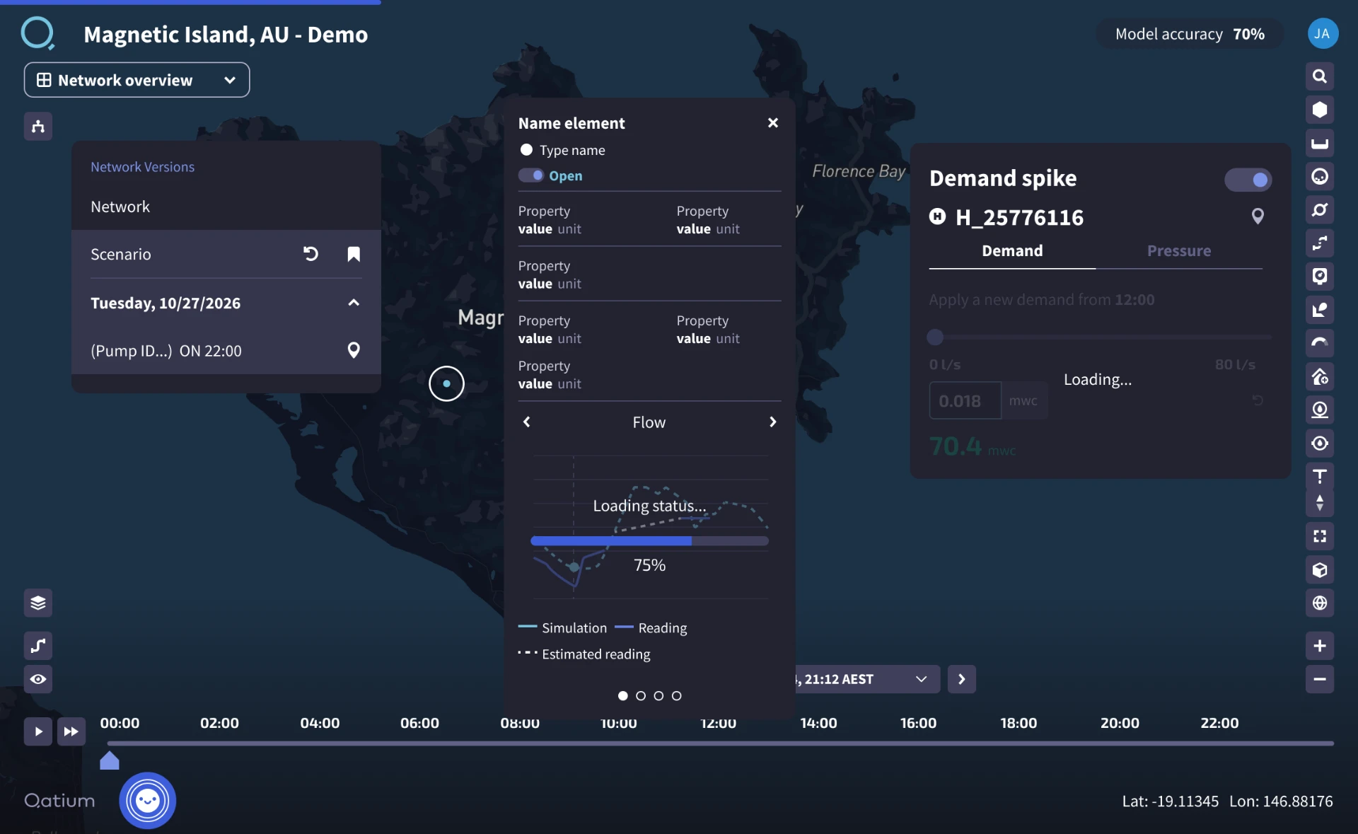
The architecture was showing through
The system is process-driven: a user action requests a new network version, and as the version is created, it fires multiple disconnected feedback events — the scenario dropdown changes, a simulation loader appears, plugin indicators flip, a popover graph loader fills up... They don't start together and don't finish together, so the UI stutters. The architecture was doing the right work in the right order; the experience just showed the engine's internals instead of the user's intent.
Business context and constraints
Perceived slowness showed up in onboarding drop-off and in sales demos, where the first minutes set expectations for everything after them. For a tool meant to support decisions under operational pressure, a wait that feels broken is a trust problem.
Engine times couldn't be reduced within the timeframe: engineering was mid-migration, moving calculations from the frontend to a backend that was still being built, so the product was slower than its eventual target. The patterns had to work across map, panels and results surfaces, stay honest rather than promise estimates the system couldn't back, and ship incrementally alongside other initiatives.
Goals
Explain the wait
Every wait should say what is happening and roughly how long it will take.
Keep interaction open
Stay non-blocking wherever the task allows, and make unavoidable blocking feel intentional.
Stop the retries
Remove the double-clicks, reloads and abandoned runs.
Ship independently
Improve the experience without waiting on engine-level optimisation.
Product principle
Design the wait, not just the result.
Feedback at the service of the user's mental model, never of the system's execution order.
Research
What I needed to understand
- Which parts of the wait are actually experienced as broken?
- What does each system event communicate, and what does the user infer from it?
- How long does each step really take?
- Where can partial results arrive before the whole thing is finalised?
I audited the scenario feedback end to end, mapping each system event to what the user saw and felt, and timed each step with engineering against real durations.
Unexplained waits were reported as much longer than they measured — and people re-triggered actions when nothing acknowledged the first one.
What I found
- The simulation loader sat at too high a visual hierarchy, reading as a broad system load rather than simulation progress
- Plugin feedback said "loading" instead of "calculating", implying a rendering delay rather than complex background work
- The popover graph loader took longest and finished last, exposing execution mechanics instead of guiding intent
- A partial result shown early was preferred to a complete result shown late
From process-driven to status-driven
Rather than firing a notification whenever an internal calculation completes, feedback maps to four stages of the user's mental model: did the system hear me, is my input okay, how much longer, and what changed.
I inventoried every loading, empty and error state across the heavy flows, then designed a consistent ladder — immediate acknowledgement, skeletons matching the final layout, progressive rendering, and a blocking state only when work truly cannot continue.
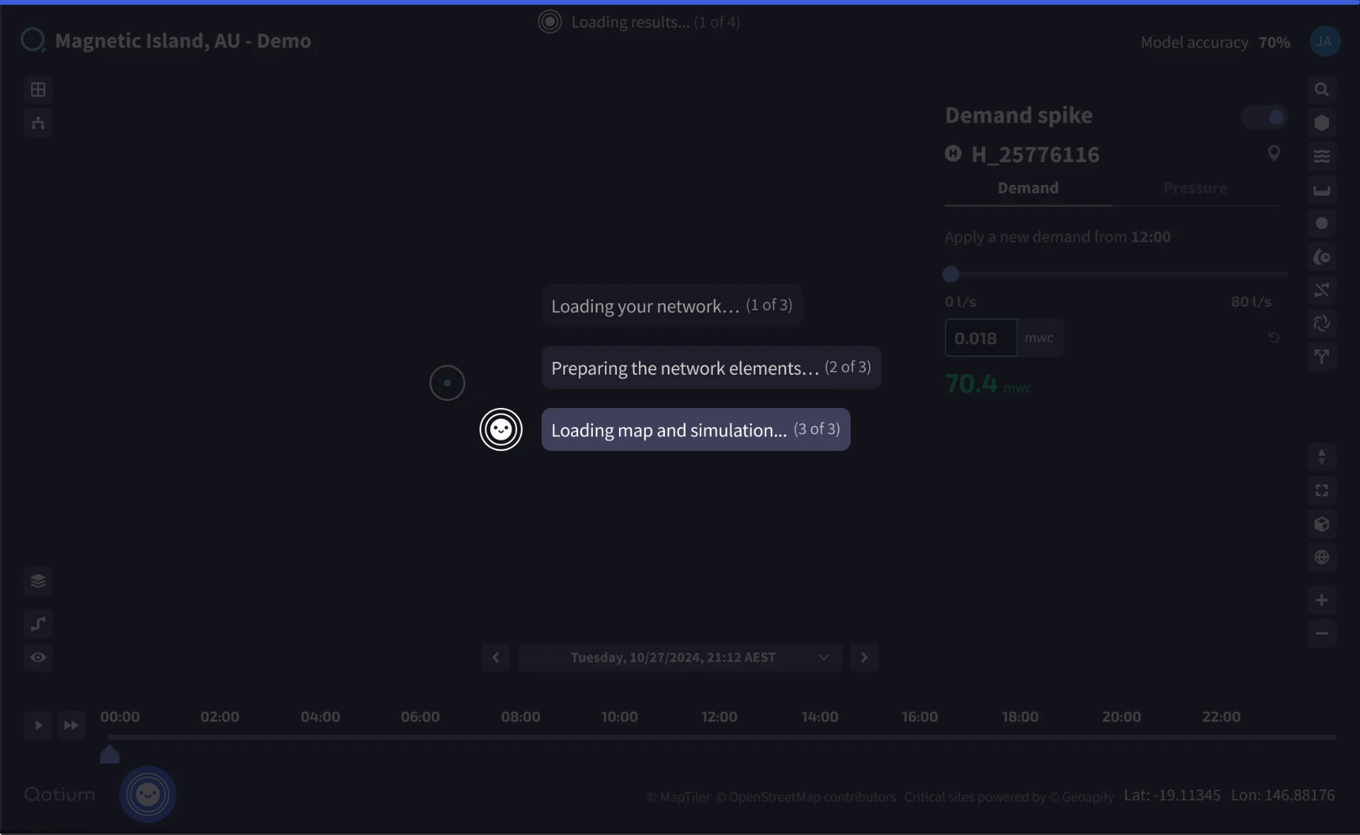
The engine never got faster. The waiting stopped being the thing people noticed.
Iterations
From estimates to honest stages
Early versions leaned on determinate progress bars, which broke trust whenever an estimate was wrong or got stuck. Later iterations replaced them with staged messaging about the step in progress, reserving determinate progress for the steps where remaining work was genuinely predictable.
Surface by surface
- Scenarios — a spinner in the scenarios panel when changes are added, the change item shifting to grey while it executes, and the panel overlay removed
- General — one overall status indicator with percentage and current step; only genuinely large calculations block interaction
- Tooltips and popovers — a skeleton loader in place of the graph loader, with readings data loaded first
- Plugins — the loading overlay replaced with a skeleton loader
Collaboration
I worked closely with engineering to understand which steps could be streamed, cached or deferred, and to agree where the system could batch its completion events into a single signal rather than emitting one per internal milestone.
With Content Design I worked on wording that stayed accurate under uncertainty — "calculating" over "loading", "comparing models" over a bare spinner. With Product Operations I iterated the final version of the UI blocking animation and style.
Key decisions
Localise the processing state
Show the loading state in a way that adds value.
Batch the events
Combine multiple internal completion events into a single progress signal.
Non-blocking as a base
Users keep full interactive capability with the rest of the app while loading and calculating states are active.
Introducing skeletons
Placeholders shaped like the real content so the layout doesn't jump when data lands.
Manage user expectations
Honest staged messaging over a determinate bar, with progress percentages reserved for predictable steps.
Outcome
Perceived speed
The same underlying timings started reading as intentional work rather than an unresponsive product.
Fewer repeat actions
Immediate acknowledgement of intent removed double-clicks, reloads and abandoned runs.
What users talk about now
Complaints shifted from "it's slow" to questions about the work itself — a sign the waiting had stopped being the thing people noticed.
The engine never got faster. The experience stopped narrating the engine's internals and started narrating the user's intent instead.
Lessons learned
Design the wait
The time between action and result is a surface, and it can be improved without touching the engine.
Follow the mental model
Feedback mapped to the user's intent beats feedback mapped to the system's execution order.
Reflection
For this project I would have aligned sooner with the CTO. Moving calculations to the backend changed the philosophy we had been following, and blocking the UI on every change was never going to work. We reached a middle ground in the end, but it would have taken less time with earlier, clearer communication.